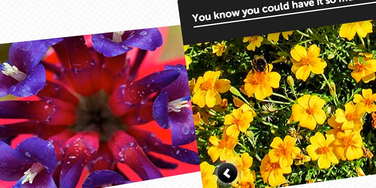
Using previously existing CSS techniques as well as new CSS3 ones, we’re going to create a pretty cool CSS only image slider with arrows and 3D transforms. To do this we’re going to use a few CSS tricks which will allow you to accomplish this.

Setting up the HTML
I’m sure very few people have trouble understand the core tenets of HTML, so I’ll just show you the code:
<div id="slider">
	<input type="radio" id="button-1" name="controls" />
	<input type="radio" id="button-2" name="controls" checked />
	<input type="radio" id="button-3" name="controls" />
	<input type="radio" id="button-4" name="controls" />
	<input type="radio" id="button-5" name="controls" />
	<label for="button-1" class="arrows" id="arrow-1">></label>
	<label for="button-2" class="arrows" id="arrow-2"<></label>
	<label for="button-3" class="arrows" id="arrow-3">></label>
	<label for="button-4" class="arrows" id="arrow-4">></label>
	<label for="button-5" class="arrows" id="arrow-5">></label>
	<div id="slides">
		<div>
			<span id="image-1">
				<span class="info">
					<strontg>Hey, you! Get offa my cloud!</strong>
					<em>(30 Mar)</em>
				</span>
			</span>
			<span id="image-2">
				<span class="info">
					<strong>You were always on my mind..</strong>
					<em>(2 Jun)</em>
				</span>
			</span>
			<span id="image-3">
				<span class="info">
					<strong>You know you could have it so much better, if you tried..</strong>
					<em>(5 Aug)</em>
				</span>
			</span>
			<span id="image-4">
				<span class="info">
					<strong>Every single night, I endure the fight..</strong>
					<em>(8 Oct)</em>
				</span>
			</span>
			<span id="image-5">
				<span class="info">
					<strong>Last night these two bouncers and one of them's alright..</strong>
					<em>(20 Dec)</em>
				</span>
			</span>
		</div>
	</div>
</div>
How this works is pretty simple. We have a few form elements which we will hide, and a label that is connected to each form element. We style the labels to look like arrows, and since they are connected to form, when they are clicked the user will ‘check’ a radio button. Then we can check if the radio button is ticked with CSS and move the image slider to the correct position using simple relative positioning.
The spans above with the id’s image-5, etc, are the slides in the image slider. We can style these directly with CSS to make them look like images or whatever we want. The content inside that (in the info spans) is the content that will appear when the user goes to that slide. Then we can use transitions to make everything run smoothly.
For this particular image slider I’m using Symbolset’s Standard icon font set (for the arrows), which you can download here for only $30.
The CSS
This is the most important bit. We are using 3D transforms to create the 3D effect which are currently not supported in opera. For that reason, the user will just see a regular image slider with no 3D effects if they use opera, and this could be modified a little using jQuery if you wanted.
We’re using sibling selectors (tilde operator ∼) so when the user checks the right radio button the correct image will show. The code we use for this looks a bit like this:
#slider #button-1:checked ~ #slides > div > span { left: 5% }
So when the user checks button 1, but whole slider will move so that it is 5% from the left, and so the correct image will be shown. The rest is just pretty basic 3D transforms and transitions. Here is the entire code:
body {
    margin: 0;
    padding: 0;
    background: url('ecailles.png');
    font-size: 62.5%;
}

#slider {
    display: block;
    height: 350px;
    width: 100%;
    margin: auto;
    overflow: hidden;
    margin-top: 60px;
    position: relative;
}

#slider #slides {
    width: 100%;
    height: 100%;
    overflow: hidden;
    font-family: Arial, sans-serif;
    position: relative;
}

#slider #slides > div {
    list-style: none;
    height: 100%;
    width: 500%;
    position: relative;
    left: 0px;
    margin: 0;
    padding: 0;
    overflow: hidden;
    /* Set 3D perspective since we're using 3D transforms */
    transform-style: preserve-3d;
    -webkit-transform-style: preserve-3d;
    -webkit-perspective: 600px;
    -moz-perspective: 600px;
    perspective: 600px;
    -webkit-perspective-origin: 10% 50%;
    -moz-perspective-origin: 10% 50%;
    perspective-origin: 10% 50%;
}

#slides > div > span {
	/* Run the tranistions */
	-webkit-transition: all 0.7s cubic-bezier(0.550, 0.085, 0.680, 0.530);
	-moz-transition: all 0.7s cubic-bezier(0.550, 0.085, 0.680, 0.530);
	-o-transition: all 0.7s cubic-bezier(0.550, 0.085, 0.680, 0.530);
	transition: all 0.7s cubic-bezier(0.550, 0.085, 0.680, 0.530);
	height: 320px;
	width: 10%;
	float: left;
	border-radius: 5px;
	opacity: 1;
	overflow: hidden;
	display: block;
	position: relative;
	font-size: 1.6em;
	top: 20px;
	z-index: 1;
}

/* Display none, so the user doesn't see whats happening with the radio buttons */
#slider input[type=radio] {
	display: none;
}

#slider #slides > div > span > img {
    margin: auto;
    height: 100%;
}

/* Style the arrows so they look nice! */
#slider .arrows {
    font-size: 15px;
    color: #fff;
    position: absolute;
    top: 290px;
    display: none;
    cursor: pointer;
    font-family: "SSStandard";
    z-index: 9999;
    width: 29px;
	height: 25px;
	border-radius: 32px;
	text-align: center;
	padding: 7px 0 0 3px;
    background: black;
    box-shadow: 0 0 20px rgba(200, 235, 248, 0.98), inset 0px 11px 24px -8px rgba(255,255,255,0.4);
}

#slider .arrows:hover {
	box-shadow: 0 0 20px rgba(200, 235, 248, 0.98), inset 0px -11px 24px -8px rgba(255,255,255,0.4);
}

/* The info boxes */
#slides .info {
	width: 100%;
	padding: 20px 20px 25px 20px;
	position: relative;
	bottom: 120px;
	border-radius: 5px 5px 0 0;
	box-sizing: border-box;
	-moz-box-sizing: border-box;
	display: block;
	-webkit-transition: all 1s 0.2s cubic-bezier(1, 0, 0.6, 1);
	transition: all 1s 0.2s cubic-bezier(1, 0, 0.6, 1);
	color: #fff;
	font-weight: bold;
	background-color: rgb(30, 30, 30);
	box-shadow: 0 0 20px rgba(0,0,0,0.3);
	line-height: 30px;
}

#slides .info strong {
	border-bottom: 2px solid #fff;
	padding: 3px 0;
}

#slides .info em {
	font-size: 0.8em;
	float: right;
	padding-top: 4px;
	color: rgba(255,255,255,0.2);
}

/* This is for positioning the arrows */
#button-1:checked ~ #arrow-2, #button-2:checked ~ #arrow-3, #button-3:checked ~ #arrow-4, #button-4:checked ~ #arrow-5 {
    right: 27%;
    display: block;
}

/* Since there is no previous sibling selector in CSS, we have to select the correct arrow, reposition it and rotate it 180deg so it appears as though it's a back arrow */
#button-2:checked ~ #arrow-1, #button-3:checked ~ #arrow-2, #button-4:checked ~ #arrow-3, #button-5:checked ~ #arrow-4 {
	left: 27%;
    display: block;
    -webkit-transform: rotateZ(180deg);
    -o-transform: rotateZ(180deg);
    transform: rotateZ(180deg);
    box-shadow: 0 0 20px rgba(200, 235, 248, 0.98), inset 0px -11px 24px -8px rgba(255,255,255,0.4);
}

#button-2:checked ~ #arrow-1:hover, #button-3:checked ~ #arrow-2:hover, #button-4:checked ~ #arrow-3:hover, #button-5:checked ~ #arrow-4:hover {
    box-shadow: 0 0 20px rgba(200, 235, 248, 0.98), inset 0px 11px 24px -8px rgba(255,255,255,0.4);
}

/* The images used in the slides, feel free to change this */
#image-1 {
	background: url('1.jpg');
}

#image-2 {
	background: url('2.jpg');
}

#image-3 {
	background: url('3.jpg');
}

#image-4 {
	background: url('4.jpg');
}

#image-5 {
	background: url('5.jpg');
}

/* The next bit is a bit wordy, but it just positions the slides at either side of the selected slide
   so we get a cool 3D effect */
#slider #button-1:checked ~ #slides > div #image-2, #slider #button-1:checked ~ #slides > div #image-3,
#slider #button-1:checked ~ #slides > div #image-4, #slider #button-1:checked ~ #slides > div #image-5,
#slider #button-2:checked ~ #slides > div #image-3, #slider #button-2:checked ~ #slides > div #image-4,
#slider #button-2:checked ~ #slides > div #image-5, #slider #button-3:checked ~ #slides > div #image-4,
#slider #button-3:checked ~ #slides > div #image-5, #slider #button-4:checked ~ #slides > div #image-5 {
	-webkit-transform: rotateY(-10deg) scale(0.8) translateX(-10%);
	transform: rotateY(-10deg) scale(0.8) translateX(-10%);
	z-index: 0;
}

#slider #button-2:checked ~ #slides > div #image-1, #slider #button-3:checked ~ #slides > div #image-2,
#slider #button-3:checked ~ #slides > div #image-1, #slider #button-4:checked ~ #slides > div #image-3,
#slider #button-4:checked ~ #slides > div #image-2, #slider #button-4:checked ~ #slides > div #image-1,
#slider #button-5:checked ~ #slides > div #image-4, #slider #button-5:checked ~ #slides > div #image-3,
#slider #button-5:checked ~ #slides > div #image-2, #slider #button-5:checked ~ #slides > div #image-1 {
	-webkit-transform: rotateY(10deg) scale(0.8) translateX(10%);
	transform: rotateY(10deg) scale(0.8) translateX(10%);
	z-index: 0;
}

/* Show the info box when the user selects the slides */
#slider #button-1:checked ~ #slides > div #image-1 .info,
#slider #button-2:checked ~ #slides > div #image-2 .info,
#slider #button-3:checked ~ #slides > div #image-3 .info,
#slider #button-4:checked ~ #slides > div #image-4 .info,
#slider #button-5:checked ~ #slides > div #image-5 .info {
	bottom: 0px;
}

/* .. and finally, move the slides into the correct position when the user clicks the arrow, so the right
   slide is selected */

#slider #button-1:checked ~ #slides > div > span { left: 5% }

#slider #button-2:checked ~ #slides > div > span { left: -5% }

#slider #button-3:checked ~ #slides > div > span { left: -15% }

#slider #button-4:checked ~ #slides > div > span { left: -25% }

#slider #button-5:checked ~ #slides > div > span { left: -35% }
Summary
This slider will work in almost all browsers (in the latest version) except opera which currently doesn’t really support 3D transforms.For opera users, though, the slider will still be functional, so this has really no effect on usability, and is more a form of graceful degradation than anything else. This kind of javascript-less slider is likely to become a lot more popular in the future, especially since it is effectively supported by all the major browser vendors.


